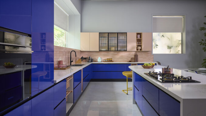
It’s easy to fall in love with dramatic kitchen makeovers featuring bold, trendy colors on social media. A moody charcoal wall here and a pop of electric yellow there look incredible in perfectly styled photos. But what works for a photoshoot doesn’t always translate to everyday life, where kitchens need to be functional spaces that stand the test of time.
“I see people making the same colour mistakes time and time again,” says Caitlin King, CEO of Wrap Your Kitchen, a company that specializes in kitchen transformations. “A colour might look gorgeous in a magazine or on your feed, but when you’re living with it day in and day out and dealing with cooking splatters and changing light throughout the day is when you discover if it really works.”
With her background in interior and home design, Caitlin has helped countless homeowners avoid costly colour mistakes. Below, she shares which shades to avoid and why they rarely deliver in real kitchens.
The Top 5 Colors to Avoid in Your Kitchen
If you’re thinking of going the trendy route with your kitchen interior, Caitlin recommends avoiding these five colors:
- Dark Brown
Rich, chocolate browns have a cozy and sophisticated feel, but they can make your kitchen feel surprisingly oppressive. Dark browns absorb light rather than reflect it, which means your kitchen will feel smaller and more closed-in than it actually is. This is especially problematic in UK homes, where many kitchens don’t have an abundant source of natural light.
“Dark brown is one of those colors that looks warm and inviting in theory, but in practice, it can make your kitchen feel like a cave,” Caitlin explains. “You’ll find yourself switching on lights even during the day, which defeats the purpose of having an uplifting and welcoming space.”.
- Bright or Bold Reds
Red is an energizing colour, but perhaps too energizing for a kitchen.It’s a shade that naturally draws the eye and demands attention, which can create a sense of restlessness in a space where you should feel comfortable spending time.
“I’ve had clients tell me their red kitchens made them feel on edge, even when they were just making a cup of tea,” says Caitlin. “Red demands attention, and in a kitchen, that constant visual stimulation becomes exhausting.”
- Stark White
White kitchens have been a popular design trend for years, but there’s a difference between soft, warm whites that work beautifully and harsh, stark whites that feel clinical. The kind of pure white you might use on a ceiling or to paint woodwork can make your kitchen feel more like an operating theatre than an inviting space.
“White shows every single mark,” Caitlin points out. “Coffee splashes, tomato sauce splatters, and greasy fingerprints all show up immediately on pure white surfaces. You’ll be constantly wiping things down just to keep them looking acceptable.”
- Neon Colors
Neon shades (think electric lime, hot pink, or fluorescent orange) might look fun and playful in small doses, but they’re overwhelming when covering all your kitchen walls. They’re designed to grab attention, which means they’re constantly demanding your visual focus, and in a kitchen, where you should feel relaxed enough to enjoy cooking and eating, they cause visual fatigue.
“Neon colors are trendy right now, but trends fade quickly, and you’ll be stuck with a kitchen that dates itself,” says Caitlin. “What looks edgy today can look tired and outdated within a year or two.”
- Pure Black
Black might seem like a sophisticated, modern choice, but in kitchens, it presents serious practical challenges. Like dark brown, black absorbs light and can make spaces feel cramped. But it’s even more unforgiving when it comes to showing dust, streaks, and watermarks.
“Like brown, every little thing shows up on black surfaces,” Caitlin notes. “Dust, cooking spray residue, water spots are all immediately visible. It’s just not worth it, as you’d need to wipe down your surfaces multiple times a day to keep them looking clean.”
Caitlin King, CEO of Wrap Your Kitchen, commented
“When choosing kitchen colors, I always tell people to think about how the space will feel at different times of day and in different moods. Soft, warm neutrals like sage green, warm greys, or creamy off-whites are your friends. They create a calm backdrop that won’t tire you out visually, and they’re incredibly forgiving when it comes to showing marks and wear.
“If you want colour, consider using it on just one wall or in your accessories rather than covering everything. That way, you get personality without the commitment, and you can easily change things up when you fancy something different. The key is creating a space that feels welcoming and practical, not one that looks good in a photo but exhausts you to live with every day.”

