
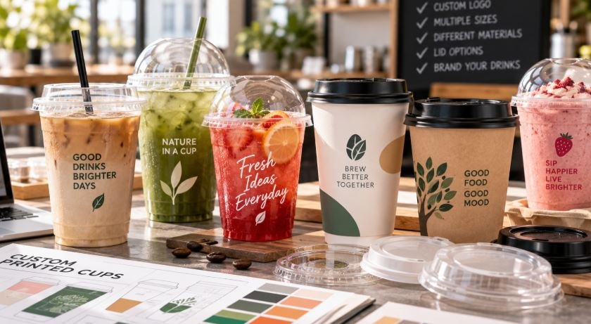
Custom printed cups look simple until a project reaches production.
A café owner may start with a straightforward request: “We need our logo printed on 16oz cups.” Then the questions begin. What material? Which lid? How many colours? Does the 12oz use the same lid? Is the artwork printable at that size? What is the MOQ for each design? Does the quantity refer to one size or the whole order?
Most problems with custom cups do not come from the printing machine. They come from decisions that were never made clearly before production started.
For cafés, bubble tea chains, juice bars, restaurants and beverage brands, these are the ten points worth confirming before artwork is approved and money is committed.
1. Decide what the cup actually needs to do before choosing the material
The first conversation should be about the drink, not the logo.
A clear cup for iced coffee, a PP cup for a drink with different temperature requirements, a PLA cup for a particular compostable packaging programme and a paper cup for hot coffee are not interchangeable simply because they can all be printed.
We normally start by asking what will go inside the cup and at what temperature.
That immediately eliminates a lot of unsuitable options.
For a cold beverage project, the buyer may be comparing PET and PLA. For another application, PP may make more sense. Hot drinks usually move the conversation towards paper cup construction, coating and wall structure.
Material choice also affects printing, storage, lids and sometimes minimum production quantity.
Changing the material after the artwork has already been approved often means going back several steps.
2. Never order a cup by “12oz” or “16oz” alone
This causes more confusion than many first-time buyers expect.
A customer may send a message saying:
We currently use a 16oz cup. Please quote the same size.
But “16oz” does not identify a cup.
Two 16oz cups can have different top diameters, heights, bottom diameters and shapes. One may fit an existing 98mm lid while another does not. One may work with a cup holder already used in stores, while another is slightly too wide.
If you are replacing an existing cup, send the supplier either:
- the current specification sheet;
- a physical sample;
- or accurate measurements.
Top diameter is especially important.
When a chain already has thousands of lids in stock, changing cup diameter just to save a small amount on the cup price can become an expensive decision.
3. Confirm the lid before you spend time on the design
Cup buyers naturally focus on the printed cup because that is what customers see.
Operationally, the lid can matter just as much.
Before approving a cup, check whether the lid:
- locks evenly around the rim;
- comes off too easily;
- requires too much force to close;
- leaks when tilted;
- works with the intended straw;
- and has enough space if toppings are involved.
For bubble tea, smoothies and desserts, dome height can matter. For ordinary iced coffee, a flat lid may be enough.
There is another practical issue: inventory.
If three cup sizes can use the same lid diameter, a café chain may be able to stock one lid instead of three. That sounds like a small detail until dozens of stores are involved.
It reduces purchasing complexity, warehouse space and the risk of employees reaching for the wrong lid during a busy shift.
4. Ask about MOQ before finalising three beautiful designs
MOQ is often where smaller brands first run into trouble.
A company may want:
- 10,000 12oz cups;
- 10,000 16oz cups;
- 10,000 20oz cups.
From the buyer’s perspective, that is a 30,000-piece project.
From the factory’s perspective, it may be three separate cup sizes, three production setups and possibly three separate printing runs.
The important question is therefore not simply:
What is your MOQ?
It is:
What is the MOQ per size, per design and per material?
That distinction should be confirmed before the designer prepares multiple artworks.
The same applies when one brand wants different artwork for different stores, flavours or seasonal campaigns. Changing the logo or design may create another production setup even when the cup size remains the same.
This is one of the first things we clarify when discussing custom printed cups with a new beverage project, because it affects almost every decision that follows.
5. Send vector artwork, not a logo copied from a website
A logo that looks sharp on a laptop screen can still be unusable for printing.
JPEG and PNG files are often fine for presentations and social media, but production normally works better with editable vector artwork such as AI, EPS or vector PDF.
The difference becomes obvious when the logo needs to be enlarged, curved around a cup or separated into individual printing colours.
Brand colours should also be specified properly.
“Dark green” is not a production colour reference.
If colour consistency matters, provide a Pantone reference or another agreed colour standard. Even then, buyers should understand that the appearance of ink can change depending on the cup material underneath it.
A colour printed on white paper does not necessarily look identical when printed on a clear cup containing iced coffee.
That is why the physical cup matters.
6. Design on the actual cup dieline
A cup is tapered.
A designer working on a flat rectangle can easily create artwork that looks good on screen but awkward once it wraps around the cup.
Ask for the supplier’s dieline before final artwork is prepared.
The designer should know:
- the printable area;
- the top and bottom limits;
- where the artwork joins;
- whether there is a seam;
- and how much distortion the cup shape creates.
Large text close to the top or bottom of a tapered cup is particularly easy to get wrong.
Logo position also deserves some thought.
Imagine how a customer actually holds the cup. A technically centred logo may end up partly hidden by the customer’s hand, a label or a drink carrier.
For chains using several cup sizes, do not automatically scale the same artwork up and down.
A logo proportion that looks balanced on 16oz may dominate an 8oz cup.
7. More print colours are not automatically better
One of the easiest ways to make a cup project more expensive and complicated is to turn a simple logo into an unnecessarily complex printing job.
Some brands genuinely need multiple colours.
Others do not.
A strong one-colour or two-colour design can be very effective on beverage packaging, especially when the drink itself provides much of the visual impact.
Think about a clear cup filled with:
- dark iced coffee;
- green matcha;
- orange juice;
- red fruit tea;
- or a layered milk drink.
The beverage becomes part of the background.
The artwork needs to work across those colours, not just on an empty transparent sample.
Before adding another print colour, ask whether it improves brand recognition or is simply decorative.
Simpler artwork is also usually easier to reproduce consistently across different cup sizes.
8. Understand what the “sample” actually is
This is another area where buyers and suppliers sometimes mean different things.
A digital mock-up is not a printed sample.
A plain production cup with the correct dimensions is not a printed sample either.
And a digitally produced visual sample may not always represent exactly the same process used for mass production.
Before paying for sampling, confirm what you will receive.
There are usually several levels of approval:
Dimensional sample
Used to check cup size, lid fit and physical handling.
Artwork proof
Used to confirm layout, spelling, logo position and print area.
Printed physical sample
Used to judge how the artwork actually looks on the cup.
For a simple repeat order, every stage may not be necessary.
For a new national brand rollout with several sizes and a strict corporate colour, skipping physical approval can be a much bigger risk.
9. Calculate storage by cartons, not just by pieces
A purchasing manager may be comfortable ordering 100,000 cups until the warehouse team asks how many cartons that means.
Disposable cups contain a lot of air. They are light, but they still occupy volume.
For large orders, request:
- pieces per carton;
- carton dimensions;
- number of cartons;
- gross weight;
- total CBM;
- and, if relevant, container loading quantity.
This matters even more with international supply.
The difference between two packing methods may not seem important at 5,000 cups. At 500,000 cups it can affect freight, warehouse space and internal distribution.
There is also a practical question for growing café chains: where will the stock go?
A low unit price is not especially helpful if six months of packaging inventory is sitting in expensive local warehouse space.
Order quantity should follow realistic consumption, not simply the largest quantity that produces the lowest quoted price.
10. Approve the complete cup system, not just the printed cup
Before releasing the order, put everything together once.
The final approval should include:
- the actual cup;
- the intended lid;
- the actual artwork;
- the beverage;
- the straw if one is used;
- the sealing film if applicable;
- the cup holder or carrier;
- and the way the finished drink will be packed for delivery.
Then use it as a customer would.
Fill it.
Close it.
Carry it.
Put it in the delivery bag.
Leave it for the normal service period.
Open it again.
It is surprising how many packaging issues become obvious during this very simple exercise.
A logo may sit too low once the cup is in a carrier. A dome lid may leave less room for toppings than expected. A straw may not fit the opening properly. Condensation may make the printed surface look different. A cup that feels rigid when empty may feel quite different when filled.
These are inexpensive problems to discover before mass production.
They are expensive problems to discover afterwards.
A custom cup project should start with the specification, not the artwork
Custom printing is usually the most visible part of the project, so naturally it receives the most attention.
In practice, the design is one of the later decisions.
A well-run project normally moves in this order:
cup application → material → size → lid → quantity → printing method → artwork → sample → mass production.
When that order is reversed, problems tend to appear later.
The buyer approves artwork before learning the MOQ.
The lid is selected after the cup.
The warehouse volume is calculated after the order.
Or the existing sealing machine is mentioned only after production has started.
None of these mistakes is unusual.
They are also avoidable.
For beverage brands, the objective is not simply to produce a cup with a logo on it. The objective is to create a packaging format that staff can use easily, customers recognise immediately and the business can continue buying at the required volume.
When the specifications are settled first, printing becomes the easy part.